The design and implementation of an Open Source animation tool.

July 25, 2007

Targets and Keyframes

My current thinking is that Moing should have two kinds of keyframes:
  1. regular keyframes -used internally to represent recorded motions; under normal circumstances they are not directly manipulated by the user
  2. target frames - normally manipulated "by hand", and are better suited for making fine adjustments to a previously recorded animation (though nothing prevents you from using target frames exclusively in your animation if you want to do that)
The curves described by these two kinds of keyframes are added together to yield the final parameter curves.

Interpolation between regular keyframes always uses smooth interpolation, but smooth interpolation may be toggled on and off on a per-target-frame basis (it's off by default); a segment between two target frames, where neither is "smooth", is simply linearly interpolated. I don't know what interpolation method should be used for smooth interpolation yet, but in order to eliminate "bounce" and "overshoot", monotonicity in the keyframes should be preserved by the interpolation function.

While target frames are usually created and modified by moving things around in the normal editing mode, regular keyframes are created (and overwritten) in "record" mode (besides recording, ranges of them can be smoothed or cleared, but they aren't otherwise manipulable). When you record a segment of motion, the initial and final frames become target frames, representing a simple linear path from start to end, and regular keyframes are created between them to capture the more complex recorded motion as deltas relative to that straight line.

This lets you adjust the overall recorded animation simply by moving the target frames (you can even add new target frames in the middle for better control). Regular keyframes are locked in time with target frames, so that moving target frames in time will also move the regular keyframes between them. Moving two target frames apart in time will also expand the keyframe animation between them, and moving them closer together will compress it. It isn't possible to move one target frame past another in the same track.

Target frames are also useful in a different respect: when an animation is being rendered at a lower framerate than it was created at, Moing will make a reasonable effort to put each target frame on a separate frame within a track (with the usual stretching effect on keyframes) while preserving the general before/after relationship between target frames across tracks. This prevents the loss of brief cuts or actions between frames.
July 21, 2007

Scene and Sequence Representation

Mike convinced me early on that we should aim for representing scenes and sequences as streams of events to the extent possible; however, there is a tradeoff involved because a stream (particularly a stream of deltas) is not an efficient representation for random access which is often a requirement in an editor. My feeling at the moment is that the best approach is to store each object separately, an object consisting of:
  • a reference the underlying asset
  • the offset into the underlying asset at which the object starts playing
  • the scene-time at which the object appears
  • a stream of parameter change events (probably with some kind of index for chronological search when in memory)
  • the duration of the object's appearance in the scene (which may be shorter or longer than the duration of the parameter change stream)
The objects also have a total (static) z-order within the scene. This means that z-order is not animatable, but I also know from my experience with Inkscape that describing changes of z-order in a stable way is fairly problematic so perhaps that's for the best. However, it should be easy to split an object in time and put the two pieces at different places in the stacking order; maybe that will be enough.

Stacking on the Timeline

One of my big frustrations with timelines in animation and NLE software is that, for a complex animation, you can end up with a whole bunch of distinct objects or layers so that you very quickly lose the ability to see what's going on in the timeline without lots of vertical scrolling. There are three remedies for this which I'd like to implement in moing:
  1. Only show the objects/layers which exist during the time interval currently shown in the timeline viewport. This means that if you're zoomed in on the end of the scene, a bunch of objects which only exist at the beginning of the scene won't result in a bunch of empty rows you have to scroll past.
  2. Don't use separate rows for objects that don't overlap in time; always show an object on the lowest possible row that respects the stacking order of overlapping objects. This mitigates the "stairway to heaven" effect where a series of sequentially appearing objects are shown on higher and higher rows in the timeline.
  3. Dynamically divide the space available for the timeline into rows based on how many rows are actually needed. When few rows are needed, this entirely eliminates the need to scroll, though scrolling will still be necessary if there are enough rows that they hit the minimum allowable height.

Poses

In addition to animating the parameters of objects in a scene, you can also define poses. Poses do not evolve over time, but are applied as deltas to the basic animation. When a scene is embedded in another, the embedded scene's poses become available as extra scalar parameters on it -- each pose parameter represents a coefficient applied to the pose's deltas. Setting the coefficients of multiple poses to nonzero values lets you mix and match them.

When editing a scene directly, its poses will most likely be available as a list in a tab in the properties pane; selecting a pose other than "Neutral" will show the animation with just that pose's deltas added in, and any changes made to parameters will change the pose deltas rather than the base animation.

July 20, 2007

Saving and Undo, Redux

I read the article Never Use a Warning When You Mean Undo today, and it got me thinking about the plans I'd laid out for saving and undo before. I think I agree with the premise of the article, but I'm not sure how to apply it to the specific case of closing editor tabs in Moing, or closing documents generally.

Generally, when it comes to open documents in any application, people tend to use editor sessions like transactions: revert/close corresponds to a rollback and save to a commit. So, undoing a close is sort of like undoing an undo...

Provding UI for simply reopening a recently closed tab shouldn't be too hard, but what should appear in the tab by default? The most recently saved version, or a recovered unsaved version? Probably the latter if the "recently closed" UI is used. But otherwise? And what happens with the close confirmation dialog?

Maybe we could simply make saving implicit when the editor pane was closed; it fits well with our "live update" model for editing. The main question then is how we recover the "revert" safety net? "Oh no, I meant to save!" is more common than "Oh no, I messed up and saved over my last good version!" but the latter does happen sometimes. If we can address that one problem somehow, I'd feel pretty confident abandoning explicit saving.

Well, actually ... there's one obvious answer: persistent undo history. Disk space is cheap these days, right? Moing has enough of those "you must be insane!" ideas already; we may as well add one more.

Update: Mike's convinced me to go with our original save confirmation plans for now; doing something slicker well may require support from the OS that we just don't have right now.

July 19, 2007

Starting Up, Fast

I said in an earlier post that a splash screen is an admission of failure. But, failure to do what?

Failure to write an application that can start up in a reasonable amount of time, is what.

It's good that you're showing the user something to reassure them that their double-clicking on the application icon actually did something. It's not so good that the bigger problem hasn't been addressed: they still have to wait around for the real application to show up, and worse they have to stare at an advertisement for the very program that's annoying them while they wait. Branding, schmanding. While I suppose you do create a branding impression that way, it's more along the lines of a Pavlovian association: oh, it's that software that takes forever to start up -- I wonder if I have any new email?

Do whatever you have to do to get the user into the application as soon as possible.

One of the contributing factors to long startup time in earlier versions of Inkscape was the fact that we pre-rendered all the icon bitmaps when the application first started, since it caused too much UI lag to render them all on-demand. This process took a while, and of course someone suggested that we add a splash screen. I proposed instead that we show the interface right away and render the icons in an idle task, which Jon Cruz then implemented to good effect: by the time the user got into the dialogs and menus, the bulk of the icons were pre-rendered. Recent versions seem to be taking a while to start up again, so perhaps it's time to look at what else we might need to optimize.

Even if you can't have a functional UI right away, it's still better to cheat a bit and show the shell as quickly as possible -- IE4 used that trick, showing the UI shell right away, but deferring any user input until initialization finished. Most users never noticed, and thought it started up faster than it really did. It's best not to resort to that kind of trickery if you don't have to, but I still think it's better than making the user sit through your pre-movie advertisement.

[Incidentally, if you're trying to use Inkscape on OS X and are having problems with an inhumanly (minutes/hours) long initial startup time, that's a problem in fontconfig specific to OS X that we haven't found a way to work around in Inkscape yet. Unfortunately, it doesn't happen to everyone, so our OS X developers are a bit stymied. I'd still rather someone spent the time to track down and fix the fontconfig issue rather write a cute splash screen for Inkscape.]

July 18, 2007

Dissection: The K-Sketch Grommet

This is the first "dissection" post, where we do an in-depth examination of one element of an existing piece of animation software, accompanied by my own anatomical sketches.

Our first example will be from K-Sketch, a program for quick and natural capture of simple animations. Although some ideas in Moing go back to the video and animation software I was using before Inkscape and Sodipodi (when I was working on an animation tool called "Animat"), K-Sketch is my most recent influence. I expect a lot of ideas from it to show up in the completed Moing, particularly with respect to performance capture. In this particular case, I would like to consider the "grommets" used in K-Sketch to manipulate selected objects as a model for the manipulation of pegs in Moing.

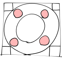
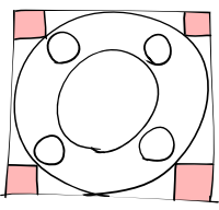
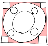
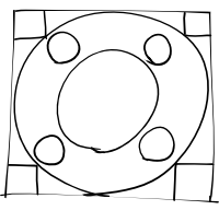
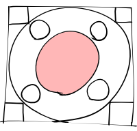
Essentially, when you select part of the drawing in K-Sketch (typically done with a lasso-style tool), the semi-transparent grommet that appears over the center of the selection looks sort of like this:

These sorts of basic handle shapes are easier to pick out against a complex background than the various arrows which some applications (Inkscape included) use, but are still distinct enough that they suggest distinct functions. Indeed, dragging each region of the grommet has a different effect. For example, dragging the central region simply moves the selection (i.e. translation):

Dragging one of the circular "handles" rotates the selection around the grommet's center:

Dragging the square handles scales the selection uniformly relative to the center of the grommet:

So far, it's all pretty obvious. If you only want to scale in one direction, that's what these regions on the side are for:

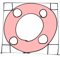
I'm not particularly interested in allowing non-uniform scaling for Moing, since I almost always see it abused to make up for a lack of non-rigid deformation (which we're going to try to do right). However, there's one last feature of the grommet which I find extremely interesting:

Dragging this ring causes the selection to follow the motion of the mouse cursor, both moving and rotating in order to keep the same part of the ring under the mouse. In K-Sketch, any motion can be recorded as animation, so manipulation of the grommet ring offers an extremely natural way of getting coordinated motion and rotation.

If we borrow only one feature from K-Sketch's grommet, the ring is the one I like the most.

July 16, 2007

Asset Parameters

An asset placed in a scene (or in a sequence) exposes a number of parameters which can be manipulated in the properties panel on the right of the editor panel when it is selected. These parameters include:
  • position - vector - the peg's current position relative to the parent (or canvas, for parentless objects); applies only to visual assets
  • rotation - angle - the object's current rotation around its peg; applies only to visual assets
  • scale - scalar - the object's current scale; applies only to visual assets
  • fade - scalar - a perceptual fade; corresponds to transparency for visual assets and attenuation for audio assets
  • amplification - scalar - amplification in dB for audio assets
Additionally, assets with "poses" expose additional scalar parameters, one per pose (more will be said about poses later). All parameters are animatable.

July 15, 2007

Inverse Kinematics

Observant readers will notice that establishing parent/child relationships between pegs essentially gives us forward kinematics, as transformations applied to ancestors propagate down the chain to affect their children. A slight extension of the scheme also gives us inverse kinematics: we can introduce an additional manipulation mode which treats the links between the child being manipulated and its ancestors as rigid, propagating the effects of the child's motion back up the chain to influence its ancestors.

In this mode, the ancestors of the manipulated peg must accommodate the motion of the child through rotation (and, for the last ancestor in the chain, translation) in order to preserve the existing distances between parent and child. How far up the hierarchy the IK chain extends goes should be controllable, perhaps via the mouse wheel, and the affected parent/child links highlighted.

There is no special representation for IK data in the scene model; the motions of the pegs are simply recorded as if they had been directly manipulated. Animations recorded in this way do not require an IK solver to play back, which eliminates problems with unstable solutions: what you recorded is what you get at playback time, because the motions are baked in.

Pegs and Parents

In the editor pane, every object in a scene is shown with a "peg" attached to it that serves as a reliable way to grab hold of the object, as well as establishing the object's center for the purposes of scaling and rotation. Pegs can be linked together in a parent/child relationships, so that one peg's object (the child) will follow the motion of the other (the parent) so long as they are linked. This relationship is one-way, so that moving the child will not affect the parent.

These links are animatable and can change over the course of the scene, so that an object can be attached to a parent for a period of time before being detached again, or even handed off from one parent to another (an object may not have more than one parent at a time). Simply parenting or unparenting an object does not alter its position; it retains the same absolute position, rotation, and scale when it changes parents.

It should also be possible to create "null pegs" which haven't an object attached; these are useful mainly for moving groups of otherwise unrelated objects together for a period of time. While "null pegs" may sometimes be created explicitly, I expect they will usually be created implicitly: a transient null peg is created whenever multiple objects are selected; if it is manipulated, then it becomes permanent (as a child of the objects' nearest common ancestor, if there is one), and the objects in question are reparented to it. In the context of performance capture, the objects will resume their prior parentage after the last frame in the captured manipulation of the peg.

July 14, 2007

SVG Assets

To be honest, I've not got much interest in writing yet another SVG implementation, particularly as a lot of things we want to do simply don't mesh well with the SVG rendering model. Internally, SVG assets will be flattened into pre-transformed shapes in a compositing hierarchy, possibly using librsvg to render through a cairo metasurface or some other virtualized drawing interface.

We probably won't be able to use SVG for animated assets because of this, as SVG animation requires the document model to be preserved. I'm a little unhappy about that, but I don't see a good alternative.

Oh, by the way: I do want to integrate with Inkscape for editing SVG assets. Perhaps we could even eventually use Inkscape's renderer to extract SVG geometry rather than using librsvg, but that level of integration is still pretty far out.

Geometric Transformations

There are two types of geometric transformation which you can apply to assets in a Moing scene:
  1. Uniform
    A subset of affine transformations, uniform transformations include translation, rotation, and uniform scaling. You don't get stretching, flipping, or skewing. These are usually controlled by manipulating the peg used to position the asset, and are rendered by applying an affine transformation to the asset as a whole. They are applied after any non-uniform transformations have been taken into account.
  2. Non-Uniform
    Everything you can't do with a uniform transformation: flipping, skewing, perspective transformations, and so on. Non-rigid and rigid-as-possible distortions fall into this category. They are generally controlled by manipulating additional pegs attached to the asset, parented to the asset's peg by default. Generically, they are rendered by dividing the asset into triangles, transforming the triangle mesh, and then rendering each triangle using the affine transformation relating the pre- and post-transformation triangles. More optimal rendering methods may be employed for particular combinations of asset type and transformation. They are applied before any uniform transformations are taken into account.
Both types of transformation can be applied to all asset types. If you want to distort an embedded video asset, go for it (I just won't promise fast rendering). It's also important to note that, for vector-based assets, apparent stroke width is not affected by either type of transformation.

Splitting Structured Assets

Some assets are structured; that is, they are a collection of sub-assets. Examples of sub-assets include individual objects in an SVG file (referenced by XML ID), layers in a photoshop file (referenced by name), audio and video tracks in an MPEG file, and perhaps even placed assets and "groups" (embedded sub-scenes) in a scene. It should be possible to work with them individually.

To this end, a structured asset can be split, revealing its constituent parts. Some structured assets are hierarchical, meaning that they can be further split. For instance, splitting an SVG file from Inkscape might reveal the top-level groups which act as layers, each of which could be further split to reveal the individual objects on that layer, and so on down.

There are two places an asset can be split:
  • In the asset pane, where the enclosing asset will be hidden and its sub-assets shown (the enclosing asset will be marked as "split" in its metadata)
  • In the editor pane, when editing a scene, the asset will be replaced in the scene by its sub-assets (with no effect on the enclosing asset's metadata)
An asset will always be shown in the asset pane while it is in direct use somewhere in the project (reachable from the top level of the project). Otherwise, provided it is in an asset directory and not marked as "split" itself, it will be shown if it is a top-level asset or its enclosing asset is marked as "split".

One implication of this is that we will need to be able store distinct metadata for sub-assets. Their initial tags are derived from their enclosing assets, plus their own name (in the case of SVG objects, its inkscape:label if there is one, and its XML ID otherwise).

Multi-monitor Displays

Recently, a few people asked about detachable panels and tabs, so they could arrange the UI comfortably for multi-monitor setups. I'd like to support multi-monitor nicely, but I don't want to force every multi-monitor user to come up with a useful layout from scratch, and if there are specific UI optimizations we could make for multi-monitor setups, I don't want to close the door to those either.

Although I have fond memories of such setups from when I was doing video production, I'm not currently a multi-monitor user. So, I'd prefer to hear from the people that are. If you're a multiple-monitor user, how are you accustomed to using multiple displays with similar applications? If you were given detachable tabs, where would you put them? I'd like to build that sort of layout into Moing itself.

July 13, 2007

Saving and Undo

Since most of the meat of the project is spread across a large number of separate asset files, I'm not sure it makes sense to have a global "save" or "undo". Probably, each tab in the editor pane should keep its own undo history while it is open.

Changes in each editor pane should be visible elsewhere immediately (at least within the same Moing session), but won't actually be committed to disk until that particular tab is saved (if you close a tab without saving, you'll be given a choice between saving or reverting).

If you close Moing with tabs unsaved, there should only be a single save/revert/cancel prompt covering all the tabs together; presenting 20 such confirmation dialogs if you have 20 modified tabs open would simply be obnoxious. (If you need finer-grained control, you can always hit cancel and close some tabs individually before exiting).

Should there be some kind of global or persistent undo history? Perhaps. But I think that if we eventually provide it, it should come in the form of integration with an SCM, probably git.

Shape Deformation

I'd like to support two methods for shape deformation in Moing:
  1. Non-Rigid
    This is essentially the same method frequently used in 2d image morphing; the displacement of the shape manipulation pegs would be interpolated over the shape using thin plate splines.
  2. As-Rigid-as-Possible
    This is essentially the Puppet Tool from Adobe AfterEffects. Moving the distortion pegs on the shape would pull it around more or less as if it were a foam rubber cutout (with the transparent areas being empty). The method was introduced in this paper.
In both cases, the user could place "shape manipulation pegs" at arbitrary places on the shape, animating their movement like any other object in a scene. Initially, they would be parented to the shape they manipulate, so they'd move with it absent any other influence.

This feature is basically our answer to shape tweening. However, shape tweening usually forces you to explicitly establish a 1:1 correspondence with individual path elements in "before" and "after" shapes. In Synfig, you're mostly only distorting an initial shape, which makes life a little better, but you still have to muck around with individual path elements. What I'm describing as "shape deformation" applies to an asset as a whole (if you need finer control of individual parts, you can do shape manipulation inside a nested scene asset), and it should work for any visual asset up to and including bitmapped images and video.

Problems
  1. I think I'd like to be able to support both methods at once, but it's not entirely clear to me how that would work in practice; at the very least, one effect would have to be applied after the other, moving the other's pegs accordingly.
  2. I'm not sure how rigid-as-possible manipulation would work for animated assets, where the silhouette is constantly changing. It may simply have to recompute the mesh for every frame with a new silhouette, which is computationally expensive (but if you want to do it, you get what you ask for). There's also the issue of how to move the "neutral" position of a shape manipulation peg if the feature it's on moves in the animation.
  3. For rigid-as-possible, I've no idea what the UI for starching or z-order assignment should look like.
  4. For finding the silhouettes of bitmap and video assets, we pretty much have to potrace the alpha channel. For video at least, we'll need to cache that information somewhere.
Due to these issues, we'll probably only implement non-rigid deformation at first.

July 7, 2007

Customization is a Liability

All too often, provisions for extensive UI customization by the end user amount to pushing the burden of UI design onto them. I'd like to avoid that if possible.

There are several reasons for this:
  1. Customization is often enough to make deep UI problems bearable, but it's seldom enough to actually fix them. People can get more or less comfortable, but then nothing ever gets done about the underlying problem.
  2. Such ad-hoc fixes aren't easily sharable, so every newbie has to discover how to make the application usable on their own. There's nothing to push upstream so everyone can benefit.
  3. Everyone's own version is potentially radically different. This renders it hard to make general assumptions that would let us optimize workflow in the application. It also makes it harder for a user to move from their installation to another's.
I think back to the incident with the Gtk file chooser: some time ago, the filename entry was removed from the Gtk open dialog in the name of "usability". You could still get it in a pop-up dialog if you knew that Ctrl+L was the shortcut to do that, but it wasn't documented anywhere and there were no visual affordances. People were understandably really mad, but the Gtk maintainers refused to change it back. Suggestions for making it configurable were made: for instance, why not have Ctrl+L show the old entry, and it would stay shown in subsequent incidences of the dialog until the user turned it off again? How about an expander widget to show or hide it? The Gtk maintainers rejected those too. Eventually, however, the push-back over the next year or so was so intense that the maintainers finally relented and returned the fiename entry to the dialog where you can find it to this day.

What would have happened if the maintainers had thrown the users a bone by making it customizable, though? Probably most Gtk users would have toggled the filename entry on and left it that way. New users would still be confronted with no filename entry by default, but, hey, it's in the FAQ, right? I doubt there would have been enough demand to get it fixed the right and simple way, so we'd have been left with a needlessly complex file dialog.

Hopefully Mike or I or whoever ultimately ends up running the Moing project won't let something that dumb continue for that long, but if we did, I'd rather have people mad enough to get it fixed properly than have the problem papered over.

July 6, 2007

"Foreign" Assets

The "All" tab in the assets pane should include not only the assets from the various asset directories, but also any "foreign" assets (i.e. those which don't live in an asset directory) which are currently in use in the project.

Integration with External Editors

As Nathan pointed out, for those asset types which we don't have built-in editor support for, it'd be good for Moing to invoke an appropriate external editor instead. Perhaps we can even have support for the VERSE protocol.

July 4, 2007

Splash Screen?

No. A splash screen is an admission of failure.

When You Wake Up in the Morning

One of the big issues we haven't addressed yet is what happens when you start up Moing from scratch, rather than opening an existing project. We pretty much have two options:
  1. Open a Moing project window with a blank project that doesn't exist anywhere as a file yet. This could be a little sticky implementation-wise, since Moing normally references assets relative to the location of the project file. We can probably limp along until absolute references until the project is saved, though.
  2. Show the user a minimal window which gives them the choice of creating a new project or opening an existing one (or just closing it). The "new project" option would throw the user right into a save dialog, perhaps with some extra widgets to set certain properties of the new project up front.
I don't have a strong opinion on which one is better, but I've got a feeling users would prefer the first one, even if it's a little icky implementation-wise.

A related issue is what we set up for initial asset directories. If we force the user to pick a filename and location up front, at minimum we could add the directory the project is saved to as an asset tab (though I'd rather encourage them to use subdirectories). If the user doesn't pick a location/filename up front, they're going to have to be on their own for picking asset directories, unless there are some global defaults. Maybe that's okay too.

Folding Panels

While the UI panels will be resizable, sometimes you'll just want to get one out of the way completely for a bit, and sometimes it'd be nice if you could devote all the window real estate to a single panel for a while. Eclipse does this; each panel has a minimize and a maximize button (except the central editor panel, which can only be maximized). I think we should follow Eclipse's lead here, at least a little bit.
  • Minimizing:
    The panel is reduced to nothing but its tabs at the edge of the window. Clicking any one of the tabs restores the panel to its prior state with that tab as the current one.
  • Maximizing:
    The panel is expanded to fill the entire window while the other panels are hidden; the minimize button is still available, and the maximize button takes on a depressed appearance (it is a toggle, after all). Maximized panels may change appearance slightly and take on a few features of other panels which are hidden.
The maximized behavior for each panel is as follows:
  1. Assets
    The asset panel becomes multi-column. Double-clicking on an asset to open it in the editor pane un-maximizes the asset panel to reveal the editor. Assets that open in external programs should probably not un-maximize it if opened.
  2. Editor
    The editor gains a widget at the bottom which has the playback cursor portion of the timeline.
  3. Properties
    The properties panel gains a viewer widget showing the asset in the editor window as well as a widget with the contents of the parameter curve editor tab from the timeline panel.
  4. Timeline
    The timeline panel gains a view widget, and also the parameters part of the properties panel.
This is a little different to Eclipse's behavior, but I hope more useful.

Asset Folders

Each of the tabs in the asset pane corresponds to a directory in the filesystem. You may get some folders automatically created and added to the asset pane when you start a new project, but you should also be able to add additional directories of your choosing. I'm not really sure of how many different ways we should support adding them; certainly, dragging and dropping a folder onto the tab area from your graphical shell of choice should work, and there should probably be a menu option somewhere to pull up a directory chooser. I don't really know how removing a directory from the asset pane should work, though it should be reasonably hard to do accidentally.

I think all of the supported assets under an asset directory should be made available in the asset panel; I don't (yet) see a need for svn-exclusion. That probably includes assets in subdirectories of the asset directory; the enclosing path of an asset in a subdirectory under an asset directory could be mined for initial tags in addition to the filename.

It's worth noting that the asset pane is just a search and organizational aid; you can directly add assets to the current scene or sequence (from a file picker invoked from a menu, or just drag and drop directly from the graphical shell, as Mike described earlier), whether or not they are available from a folder in the asset pane. Assets are referenced directly, without respect to the asset directory they may have come from. Removing an asset directory from the pane won't remove any in-use assets from the project.

July 3, 2007

Auditioning Your Assets

Even with tags and thumbnails, you won't always be certain that an asset is really the one you want just by looking. This is particularly true for animated scenes (where the frame in the thumbnail may not be the most distinctive one) and for audio clips (where the thumbnail simply isn't that helpful). So, we talked about two possible ideas for having some kind of in-place live preview for the asset pane:
  1. A big "play" button that appears in the corner of the thumbnail when you mouse over it (Google Video style); you would click it to start the preview playing
  2. Simply mousing over the thumbnail starts it playing
The second one seems more convenient, but it could also be annoying. If things start playing as soon as the user mouses over them in the asset pane, the user's likely to start avoiding it with the mouse. Adding a little delay before the clip started playing would help, but such a delay has a couple disadvantages: the user might get impatient waiting (it not being evident how long they have to wait), and they might get startled if they don't gauge the timing right.

As a result, I'd like to suggest a combination of the two approaches: when the user mouses over a non-static asset in the asset pane, they get a round play button in the corner of the clip with a "marching circles" countdown around its perimeter. If they want a preview, they can either click the button or wait for the countdown to complete. If they don't, they can clearly see how much time they have to move the mouse out of the thumbnail before the countdown expires.

The button would disappear once playback began, but only after a delay. During that time, clicking on it would have no effect. That way, the user can't "miss" if they meant to click on it to start playback but weren't quite fast enough. Other than that, clicking on a playing clip (being the usual prelude to dragging or double-clicking it) would stop it playing, as would mousing out of it.

Auditioning should probably be disabled at certain times, like when the current scene is being played back.

Oh, and one last nicety: the audio levels for loud clips should be dropped/normalized when they are auditioned so that the user doesn't accidentally blow out their eardrums when they have the volume turned up (e.g. because they are working on a stretch of animation with quiet dialogue).

Asset Entry Vectors

Somewhat building off mental's previous post, I think there should be three vectors for addition of media to the assets:
  1. Drag-n-Drop
  2. Explicit menu/context menu
  3. Automatic inclusion of media in folder
Of these, #3 is the trickiest. We probably already want folder monitering, so that things like files dissappearing, files being modified are handled well. For this we also need to handle figuring out what is new on startup, and maintain a list of file exclusion (an example of this is tortoiseSVN, where files may be added to svn by default).

As for the Drag-n-Drop, it would also be nice to be able to drag files onto the field, as in inkscape, and have the asset automatically added and included at that point on the field.

Drag-and-Drop

For assets, we should at least support dragging from e.g. file managers into the asset panes (copying the dragged file into the corresponding asset directory), and from the asset pane into the editor pane and perhaps also timeline (to add an asset to the open sequence or scene).

Where else might drag-and-drop be helpful? Drag-and-drop from the editor or timeline pane elsewhere might possibly be useful, but I'm not sure how to distinguish those drags from drags that reposition objects. Any other ideas?

Asset Search and Tagging

The entry at the top of Mike's asset pane mockup is a keyword-based live search; the user would enter keywords, and the assets shown in the pane would be restricted to those whose tags matched all of the given keywords (if any are given).

To avoid search result "yo-yo-ing" due to incompletely entered keywords, our thinking is that the new contents of the search entry shouldn't take effect until the user:
  1. types a whitespace character
  2. "commits" (hits enter, changes input focus, etc)
  3. stops typing for some short (empirically determined) amount of time
Rather than showing the filenames (as shown in the mockup), we'd probably show the tags in edit-in-place form instead. An otherwise untagged asset would get default tags generated from its filename; for example (and I suppose the the availability of these examples demonstrates the value of a more detailed mockup):
  • Columbo.svg → svg image columbo
  • uccello_profilo_02_archi_01.svg → svg image uccello profilo archi
  • tweets.ogg → ogg audio tweets
Note that the file extension tag is placed before the rest of the generated tag, to avoid confusion with the filename, and also the addition of a tag reflecting the type of content (perhaps the filename and type tags should be automatic and implicit always, though?).

Generally the ordering of results would be most recently used/added/updated first; probably all unused assets would get placed before any used assets as well.

Update: Mike's convinced me that if we're adding additional tags beyond what we get from the filename, we should probably move them all to the end of the tag list, with the extension tag, as they just obscure the more important tags otherwise (and there's less risk of confusion with the filename anyway).

Update: Internationalization's going to be a problem for the automatic tagging, given languages which tend not to separate words with whitespace. Such users should hopefully still be reasonably comfortable using whitespace when manually tagging, but probably aren't going to be using easily-recognizable delimiters in their filenames.

Update: On the other hand, if we're doing substring matching on tags, it probably doesn't matter too much.

July 2, 2007

Assets Mock 1


Here's another portion of that extravagent mockup I was working on.

The tabs at the top act as filters on the content. It also displays information about each clip through the background color/border. Here, the green background means the particular media clip is on the Field, blue means the clip is new/not yet used, and the border indicates usage somewhere within the project. The unused/fielded clips will be given a bit of priority, and will tend towards the top.

This is a pretty rough design. I think there should be some visual indication of clip status (perhaps they could just be sectioned off!), but the specifics remain elusive.

Overdoing design

Fully designing something before its implementation can easily go hideously astray. I might even go as far as saying that it often does. Done right, however, we're willing to bet it's quite valuable.

It's all about the total effort expense of a project. As MenTaLguY pointed out, in terms of expense, code > mockups > words. Spending some well placed effort on the latter two, however, will enable the code to come more easily, with fewer rewrites, more bang for your buck.

Massive specifications, intricate UML diagrams, and all the other paraphernalia of the 'well planned' software project take way too much effort, and have little value. Rather, simply figuring out how things will work, is good. It allows you to consider the consistancy, unity, and usability of the design in a critical light, picking out flaws and issues before they reach code.

Fried Green Audio

For me, a frequent annoyance of audio applications is the need to actually play back audio to check the levels. If your audio's fried, you shouldn't have to listen through the whole thing watching the meter, it should be blindingly obvious right away.

Not only should the level meters and peak indicator update when you scrub audio (so many apps don't even do that!), I think peaking should be indicated in the waveform preview itself: if a pixel column in the preview waveform includes a sample which hits 0dB, that whole column should be colored red.While I'm at it, there should probably also be a similar (but more subdued) indication of sample ranges which are over some (settable) nominal level. If you're authoring for DVD, for instance, you generally want to keep your levels below -20dB.

Hmm. I guess in addition to a level meter, we should also have a master audio track where we can do master audio automation and get a waveform preview of the mix.

Anatomy Mock 2


I've svgerized mental's proposed overall layout into this.

It's part of a more elaborate, incomplete mockup, which will stay incomplete - I realized it is too early to invest much work in mocks.

Clip Editing

Mike and I were talking about the asset pane when he raised an interesting issue: double-clicking on an asset in the asset pane opens it in the editor -- so what happens if you double-click on a basic asset? It seems like it'd be useful to be able to do some basic editing on an imported clip -- trim out some frames, maybe play with the audio levels, that kind of thing.

At the time it seemed like a bad idea to me, but I've warmed to it as I've thought through it more. Ideally you're doing video cleanup in another app, but if you just need to trim a little off, why not be able to do that (non-destructively) in Moing? So, I think the rule for editing basic assets is pretty much:
  1. Still Images
    You can view the image in the editor field. The transport controls are disabled. Nothing interesting in the timeline.
  2. Clips
    You basically get a restricted set of features from sequence editing: you can play the clip in the editor window, and in the timeline you start out with a segment for video and one for audio, as applicable. They can be split/cut/extended/reordered, etc., but you can't otherwise add new segments. Not sure what happens if you try to delete the last remaining audio or video segment; maybe it doesn't let you.
For clips, any edits made would be stored (in sequence format?) in a file alongside the original clip file.

*Update*: for still images, we should probably launch an external editor.

Assets in Moing

Here are the sorts of assets I envision us being able to work with in Moing:
  1. Basic Assets
    Basic assets are standalone assets, normally created in other programs.
    1. Still Images
      Individual still images; a PNG file, for instance. The distinguishing characteristic of a still image is that it does not change over time and has no fixed duration.
    2. Clips
      Sound or moving video (with or without sound); think AVI or WAV files (I don't really know which specific formats we will support yet).
  2. Composite Assets
    Composite assets are normally created and edited in Moing, and amount to collections of other assets which are stacked in some z-ordering and come and go over time.
    1. Sequences
      Assets are always rendered full-frame; sequence editing works more or less like in a traditional non-linear editor.
    2. Scenes
      Assets are explicitly positioned on the field and can be scaled, rotated, distorted, and connected together with armatures.
All assets exist as individual files and the project as a whole is represented by a single file which references (or contains?) a top-level asset (e.g. a "master sequence") which references other assets and so on down.

Frame Rates

Generally, Moing should be pretty forgiving about frame rates. If you want to place a 15fps clip or character animation in a 30fps project, it should let you do that. If the framerates aren't exactly multiples, then you aren't guaranteed great results as frames will be held or dropped, but it should still work and the timing should come out right. Similarly, you shouldn't be required to match audio sample rates to the project rate (though, again, you will get the best results if you don't make Moing resample on-the-fly).

The timing of events should probably be stored as a rational, with the frame number as the numerator and the framerate in effect when the event was created/positioned as the denominator. That way, you can keep your timing across framerate changes without doing hard re-quantization.

We should directly support the NTSC frame rate of 29.97 frames/second somehow. It's ugly, but it's a fact of video. One way would be to multiply the numerators and denominators by 100, so e.g. PAL frame numbers would be over 2,500, and NTSC frame numbers over 2,997. If we're using Haskell Int for our rational numbers, that comes out to about 50 hours before our numerator rolls over. That... should be enough (famous last words).

The Acid Test

When all is said and done, the final test for Moing will be to find a piece of loose, floppy animation from the 1920s (old enough to be public domain) on YouTube or archive.org or someplace like that, and recreate it in Moing. Not a pixel-for-pixel recreation, not tracing, but a fairly close recreation that captures the feel of the original work.

If you can't do convincing old-school squash and stretch, you can't do convincing animation.

Anatomy of Moing

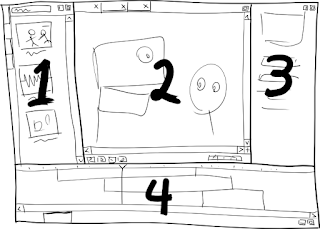
Building on what Mike posted earlier, here's my current thinking for the parts of Moing (we'll ignore obligatory nicities like the menu and status bars):


  1. The Assets Pane
    Keyword-based search with live previews of assets like movies, sound clips, scenes and characters. Assets can be double-clicked to open a new tab in the editor pane, or dragged to the field/canvas in the editor pane to add that asset to the current scene. Each asset directory in the project gets its own tab, as well as an "All" tab which pools them all.
  2. The Editor Pane
    A tab for every asset currently being edited. The current tab here determines what is shown on the canvas and in the properties and timeline panes. While it has the transport bar at the bottom, it's principally used for arranging things in space. Everything is editable on-canvas to the greatest extent possible.
  3. The Properties Pane
    Properties for the current asset/selection in the editor pane. Pose editing (interpolating between pre-defined poses) also happens here.
  4. The Timeline Pane
    Principally used for arranging things in time via an NLE-style timeline. Rather than having fixed layers, space is distributed according to the stacking order of overlapping elements, minimizing any need for vertical scrolling. A second tab in this pane yields a parameter curve editor slightly like the Blender IPO editor (but simpler), for those hopefully rare occasions when it's required. Perhaps the curves shown should depend on what parameters are selected in the properties pane.
Any of the panes can be "expanded" to fill the entire window, which may alter their appearance and/or behavior somewhat to utilize the extra space and keep critical global functionality (like the transport bar) visible. All of the panes except the editor pane can also be "collapsed" to the side of the window, exposing only their tabs (clicking on a tab un-collapses).

July 1, 2007

The Philosophy of Moing

  1. Words are Cheap
    I keep finding myself with a really spiffy idea for a piece of software, then I find myself bogged down implementing specific ideas that never really work out, rewriting code again and again until I find an idea that works. I'm not one to underestimate the value of prototyping, but often that prototyping can be done at a much earlier stage. Words are cheap, and they're a lot easier to take back than code. This time around, "paper prototyping" is the order of the day.
  2. Haskell, Why Not?
    At this point in my life, I'm pretty sick of doing application-level programming in C and C++. My minimum requirements for a new project these days are automatic memory management and lambda, but once you have those most languages look pretty much the same. Haskell's one of the exceptions. If you choose to take advantage of the type system, you can replace a lot of run-time assertions with compile-time checks. That means a lot to me.
  3. Shape Tweening is All Wrong
    Perhaps tweening's not inherently a bad idea, but on the evidence of extant implementations, doing it well is a Hard Problem. Usually the results of shape tweening are painfully distinctive and not at all appealing. Synfig does better than nearly any other application I've seen, but it still requires a lot of work to get a good result; the problem of a good user interface for tweening is still very much unsolved. So, I'd like to look at alternate approaches: armatures and non-rigid shape manipulation.
  4. Performance, Performance, Performance
    The thing behind the wrongness of most computer animations is the fact that the problem animation is the end product of a long series of tweaked parameters. The trouble with tweaking is that you become blind to your own work if you stare at it long enough. If you want to be able to stop tweaking before you lose the ability to see your own work, you need have a decent performance to build on up front. That means performance capture. No need to break out the bodysuit and ping-pong balls, however -- for 2D animation, I think we can get pretty far with just a mouse.
  5. Animation is not Drawing
    The truth is, unless you're committed to traditional animation techniques (not our target audience), you're doing your drawing and your animation as separate steps. Most animation packages try to be the best ever drawing package and the best ever animation package at once, inevitably failing on both fronts. We've got plenty of decent drawing tools out there already, so let's just focus on animation. Make the parts of your puppet in Inkscape; give them life in Moing.

Initial mockup


Here's my initial moing-mockup. Current plans also have panes to the left and right.