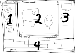
Building on what Mike posted earlier, here's my current thinking for the parts of Moing (we'll ignore obligatory nicities like the menu and status bars):

- The Assets Pane
Keyword-based search with live previews of assets like movies, sound clips, scenes and characters. Assets can be double-clicked to open a new tab in the editor pane, or dragged to the field/canvas in the editor pane to add that asset to the current scene. Each asset directory in the project gets its own tab, as well as an "All" tab which pools them all.
- The Editor Pane
A tab for every asset currently being edited. The current tab here determines what is shown on the canvas and in the properties and timeline panes. While it has the transport bar at the bottom, it's principally used for arranging things in space. Everything is editable on-canvas to the greatest extent possible.
- The Properties Pane
Properties for the current asset/selection in the editor pane. Pose editing (interpolating between pre-defined poses) also happens here.
- The Timeline Pane
Principally used for arranging things in time via an NLE-style timeline. Rather than having fixed layers, space is distributed according to the stacking order of overlapping elements, minimizing any need for vertical scrolling. A second tab in this pane yields a parameter curve editor slightly like the Blender IPO editor (but simpler), for those hopefully rare occasions when it's required. Perhaps the curves shown should depend on what parameters are selected in the properties pane.
Any of the panes can be "expanded" to fill the entire window, which may alter their appearance and/or behavior somewhat to utilize the extra space and keep critical global functionality (like the transport bar) visible. All of the panes except the editor pane can also be "collapsed" to the side of the window, exposing only their tabs (clicking on a tab un-collapses).

3 comments:
Panes are better than separate windows. Rearrangeable panes are better still. Good idea.
Rearrangeable and *detachable* panes are even more fantastic, for those who have two screens and would like to detach them and move them to their secondary screen.
I'm not a big fan of panes that detach into separate windows because they create a lot of "interesting" UI problems. BUT, it's obviously useful to separate the property windows from the editor when you've got multiple screens.
How about an option to fullscreen the editor in a different screen, moving it out of the "main" window (which then becomes effectively a tool palette)?
Post a Comment